Brutalist Festival Identity & AI Motion

Challenge
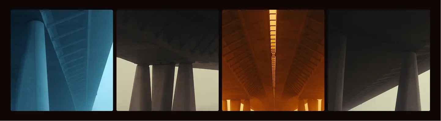
By The Creek needed to evolve away from generic electronic music festival tropes and establish a distinct, mature identity for its upcoming 10th anniversary edition. The brand required a system that felt raw, structural, and monumental, capable of scaling seamlessly across digital marketing, trailer motion graphics, and large-scale physical location branding at their iconic bridge venue.
Solution
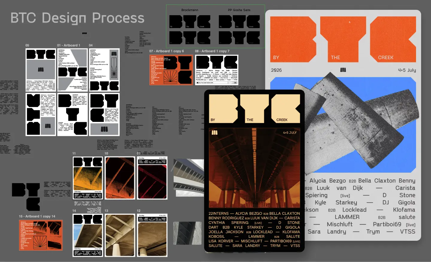
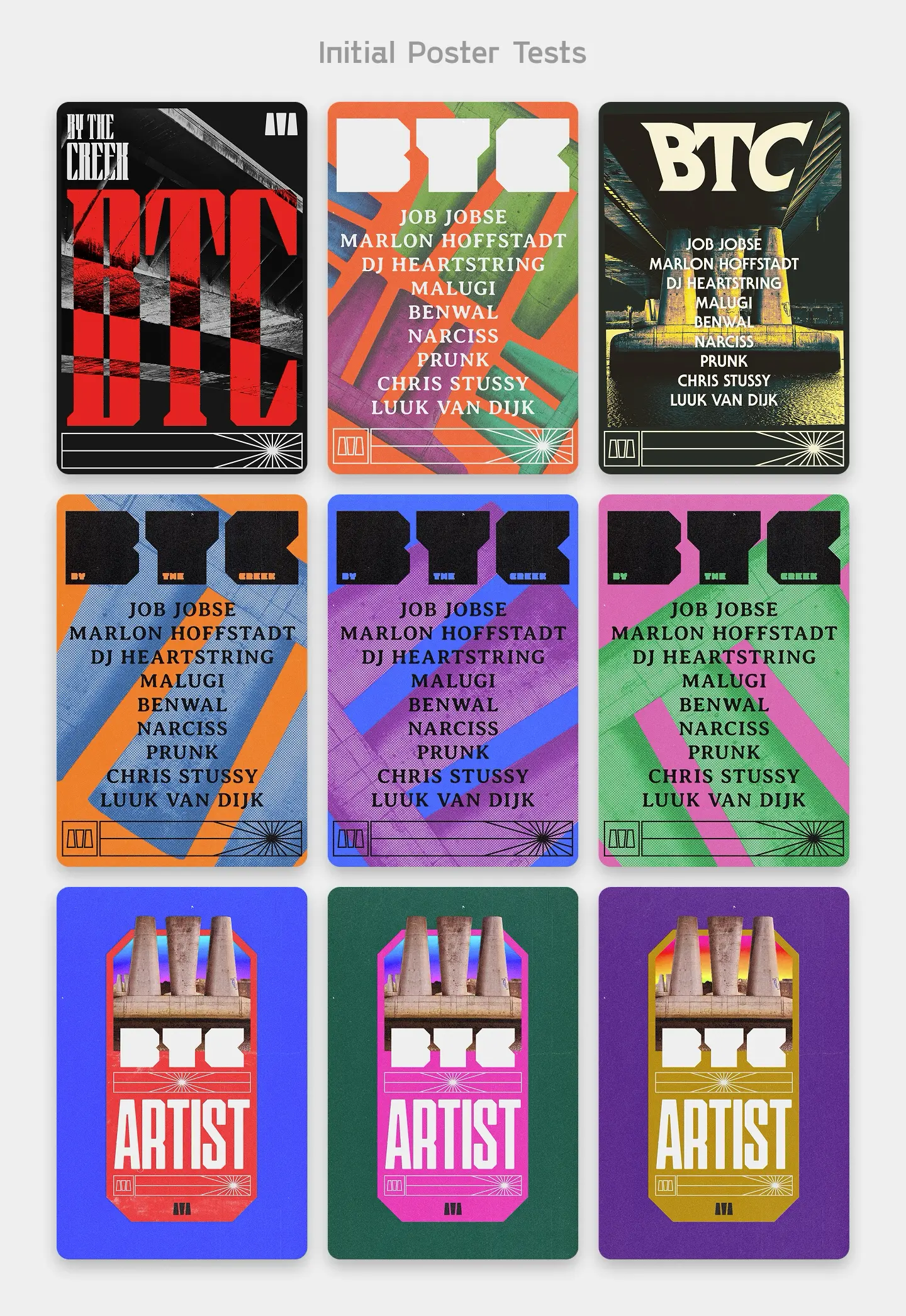
1. Architectural Identity System: Developed a brutalist visual language anchored by a custom heavy-weight logotype and the iconic 3-pillar bridge symbol, emphasizing structural strength and functional reduction. 2. Strategic Brand Voice (TOV): Formulated a precise, confident copywriting framework ("Big on feeling, small on fuss") that strips away hype-language in favor of intense, monumental statements and architectural vocabulary. 3. AI-Driven Trailer Motion: Produced cutting-edge AI animations for the festival's campaign trailer, visually translating the "rebirth of an icon" and the visceral energy of the crowd. 4. Scalable Physical & Digital Application: Designed a comprehensive design system with chamfered edges and modular architectural patterns, optimizing applications from mobile UI and social media down to on-site physical stage banners and token booths. 5. Curated Elemental Palette: Established a highly restricted, nature-and-architecture-inspired color palette (Concrete, Sand, Brick, Sky, Night) to ensure high contrast and uncompromised brand consistency.
Result
The rebrand successfully elevated By The Creek from a standard festival to an architectural, timeless music institution. The uncompromising visual identity and AI motion campaigns cut through industry noise, creating massive anticipation and solidifying the festival's authority in the Dutch electronic music scene.