Home Security Brand & UX
Key Takeaway

Challenge
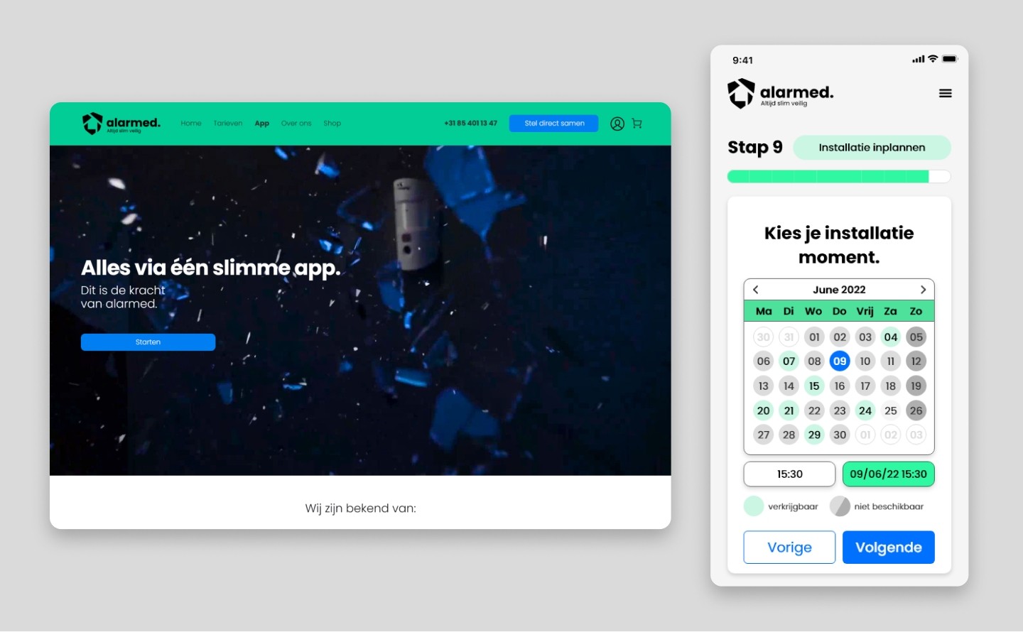
Home security apps often suffer from cluttered interfaces and panic-inducing notification systems. Alarmed required a UI/UX that felt protective, reliable, and incredibly simple to use during high-stress situations or daily monitoring.
Solution
1. Trust-Centric Visual Identity: Developed a brand aesthetic utilizing calming, authoritative colors (deep blues, clean whites) to project stability and security. 2. Frictionless App UX: Designed intuitive mobile dashboards for arming/disarming, live camera feeds, and automated emergency protocols. 3. Calm Notification System: Engineered a hierarchy of alerts that informs users without unnecessary alarm, using clear iconography and haptic feedback. 4. Hardware Integration Flow: Created a seamless, step-by-step digital onboarding process for pairing new physical sensors and cameras.
Result
The Alarmed app set a new standard for user experience in the smart security sector. The intuitive design dramatically reduced false alarms caused by user error and resulted in exceptionally high customer satisfaction ratings on app stores.